CosMeet Mobile App Case Study
My Role
Team Lead
UX Designer
User Researcher
Product Designer
Tools Used
Figma
FigJam
Google Suite
Adobe Illustrator
Adobe Photoshop
Team Members
Nancy
Diana
Yasmeen
The Problem
People looking to connect with others of a compatible astrological sign need a way to find their potential match and find lifelong connections.
The Solution
A new mobile social application that allows people to find like-minded individuals that share astrological beliefs when looking to gain lifelong connections with others.
The User
People who are interested in developing relationships and connections from the use of astrology.
The Goal
To create a unique tool and resource for individuals to find meaningful connections as well as understand their cosmic interpersonal placements with enjoyable dating and conversation.
RESEARCH
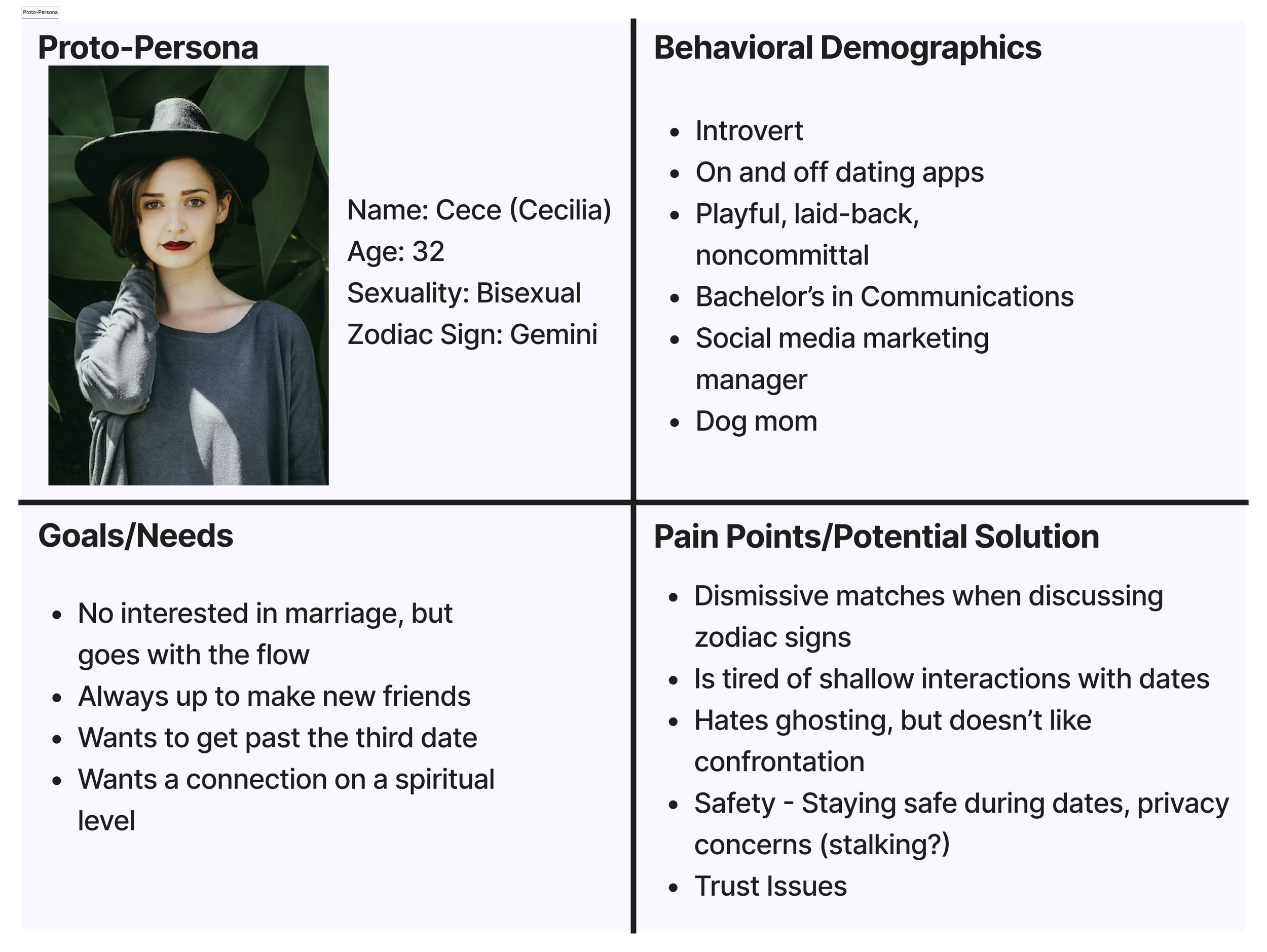
We started with creating a proto-persona. With this persona, we took into thought our own experiences with dating apps as well as our friends’ experiences with the app. We also had influences from our engagement with social media and seeing what other people had to say about their own mobile dating app experiences. Our persona, Cece, best displayed our collective idea of what someone interested in dating and astrology would find appealing about using our app.
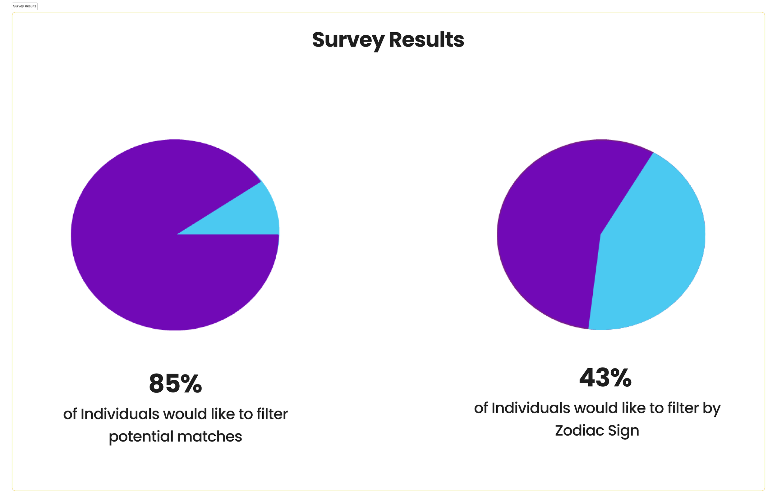
With an idea of who might be interested in our app, we set about getting user’s thoughts and experiences with what they enjoyed about the apps and what they thought could be improved. To gain better insights, we decided talking directly to app users was the best way to get insight into individuals unique experiences and ideals when online dating. We interviewed six different users within the age range of 25-36, an age range we believed to be at a stage where they’re looking to settle down. We also sent out a survey to various groups and through social media to get a standing on the general population’s thoughts on different ideas and features behind dating apps.
DEFINITION
With our results, we learned that users were highly motivated to use a social app that better catered a selection of potential matches that had more of a basis in astrological connection and a deeper understanding of what brought users together outside of physical features and hobbies.
With the information and data gained from our user interviews and survey, we compiled the information into an affinity diagram. Through use of an affinity diagram, we could organize the information gained into different categories where the users had similar thoughts.
The notes from the interviews and survey could be grouped into 5 different categories: Dating Apps, App Features, Match Preferences, Preferred Methods of Communication, and Pain Points. With this organization in place, it was clear to see what our users would want to see differently in mobile dating apps. There were challenges and positives associated with dating through apps that our users communicated to us.
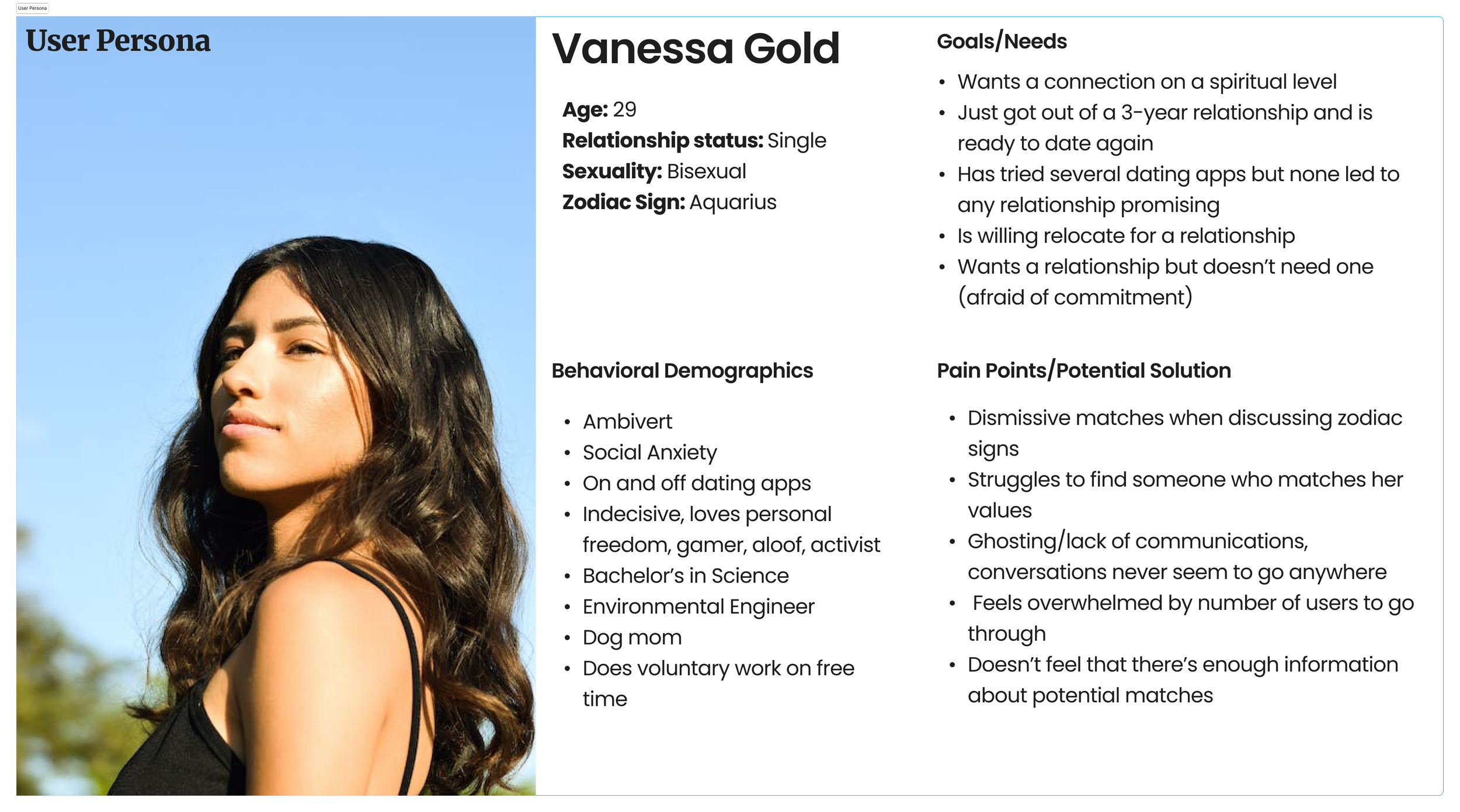
We redeveloped our proto-persona, creating a user persona, Venessa Gold, who better reflected our targets users with information and research gained that we previously did not have.
To keep our design focused on the user, we created a user insight statement. This would be a statement we would refer to as we continue with our design process, serving as the indicator that our final product effectively addresses the needs of our target users.
User Insight Statement
We have discovered that people who are interested in relationships and astrology put a heavy importance on finding lifelong connections and communications in their romantic and platonic interpersonal relationships.
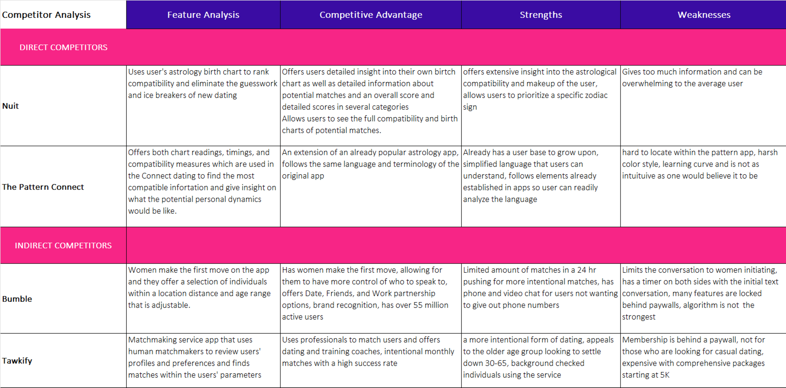
The mobile dating app market is highly saturated with several different apps providing the service of connections to other. In order to understand the market and keep up to date with the competition and trends, we conducted a competitor analysis of three other dating apps: Bumble, Tawkify, and Nuit. These apps were the best comparisons of what we were trying to do, helping us identify the strengths and weaknesses needed to be addressed in the building of our app.
IDEATION
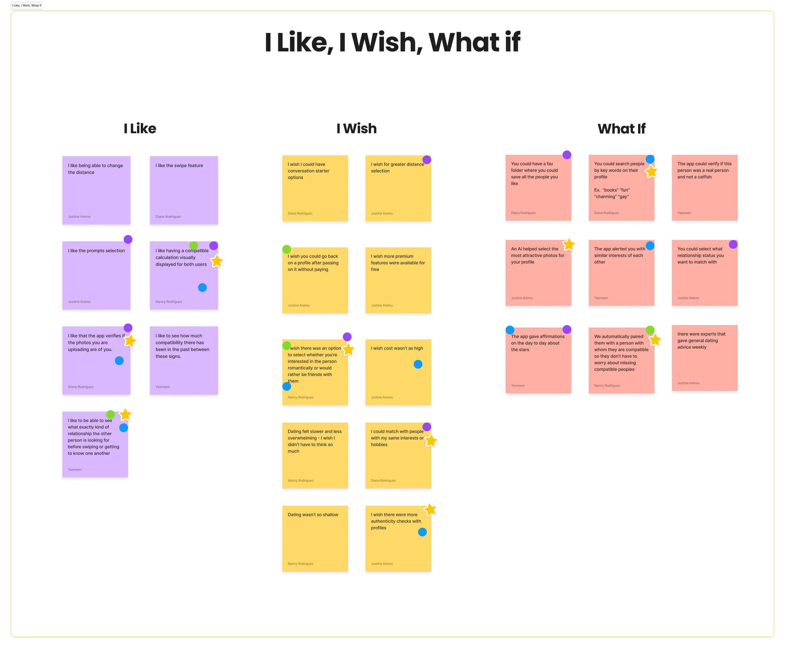
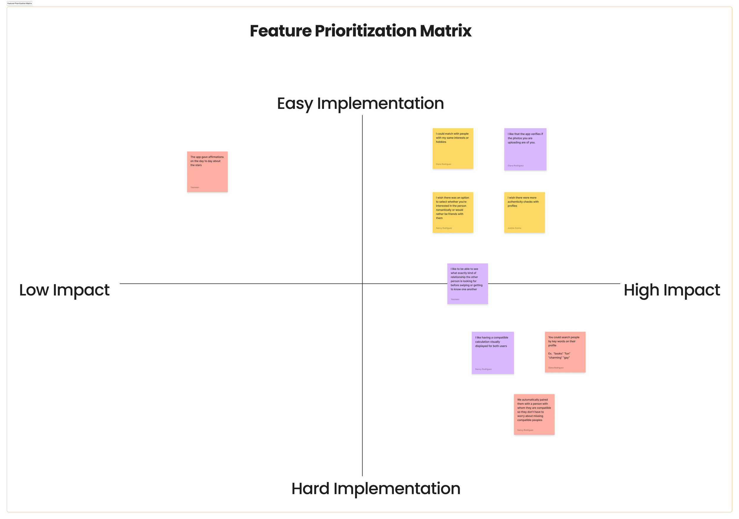
The information gained from our research helped us focus on what features we wanted to bring to our app. We began to ideate what these features were through “I Like, I Wish, What if” Method. Once we spent some time on this as a team, we participated in dot voting to determine which features should have prioritization when creating our app. We compiled the effects of the app as developers and for the user through a feature prioritization matrix.
The matrix provided a visual guide on what features should be prioritized in our first round of the design process. These features were catered to focus on curated match compatibility and astrological chart readings. From this point, we could create our value proposition statement, helping us combine what our users need from our app, what makes us different from our competitors, and continue to guide our design decisions.
Value Proposition Statement
Our mobile social app CosMeet is developing a way for people to find their ideal connections through zodiac compatibility to help ease the individual’s anxiety and mitigate the overwhelming options of matches that lead to the deletion of the app.
We stand out because we offer in-depth analysis of compatibility in order to provide them with more curated selection of potential matches.
We’re unique because we take on the major burden of finding compatibility for our users and allow the users to focus solely on chemistry.
PROTOTYPING
We decided on the name CosMeet for our app. The storyboard was developed to give insight in how our user persona would come upon our app to show what caught their attention and gives them an active want of using our app.
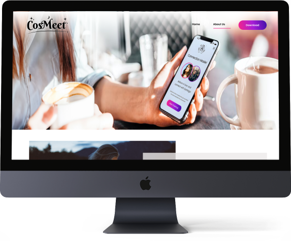
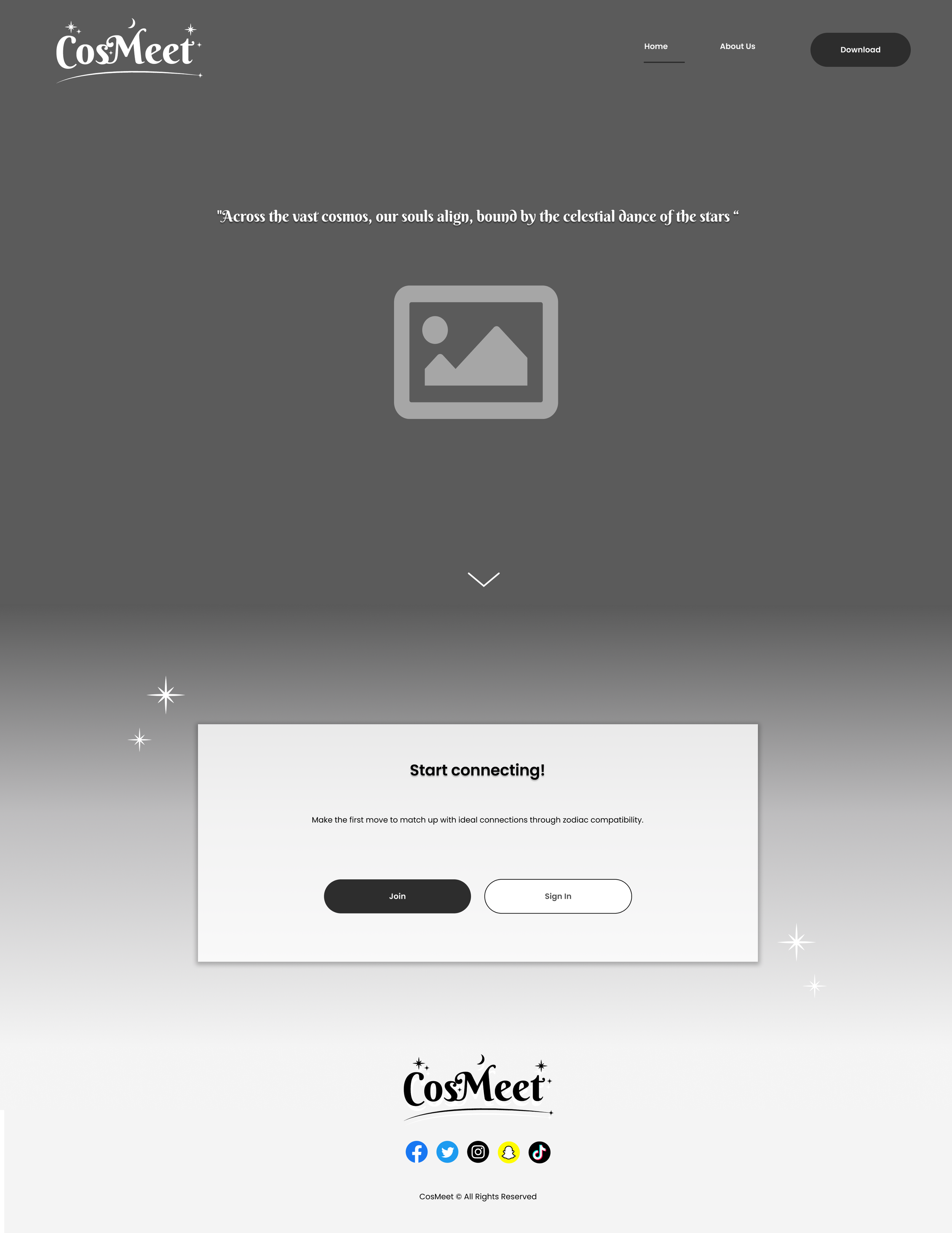
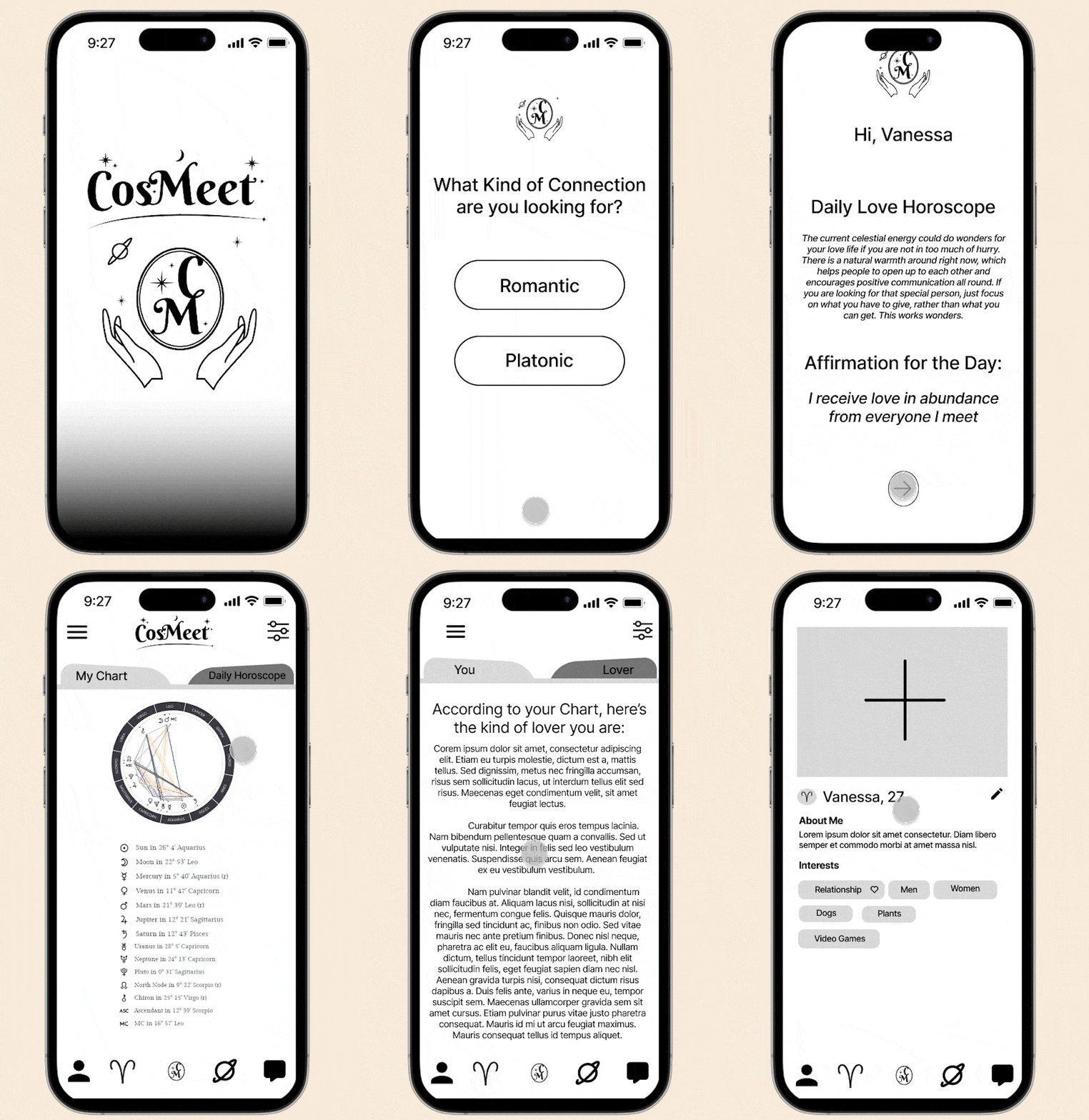
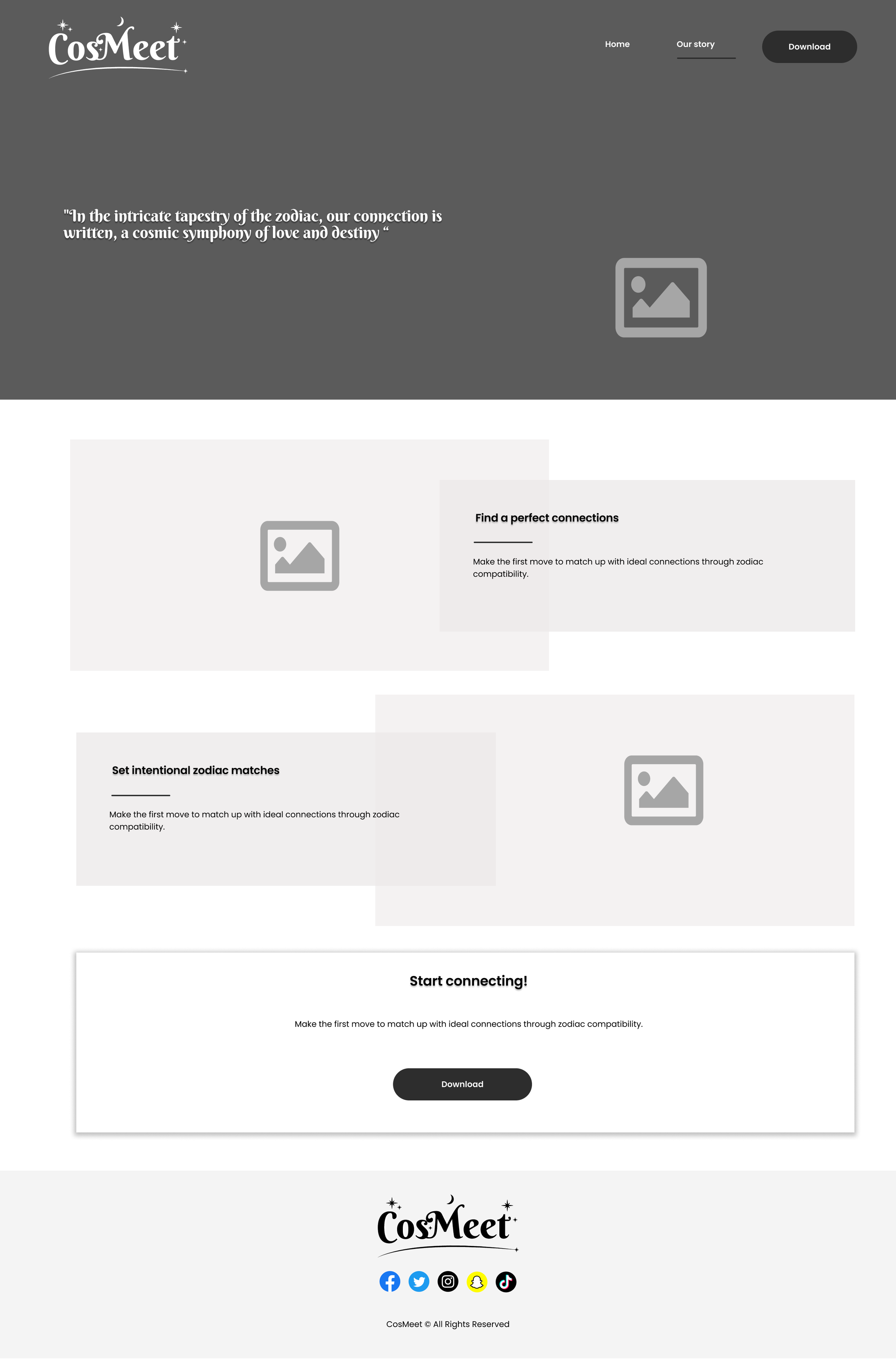
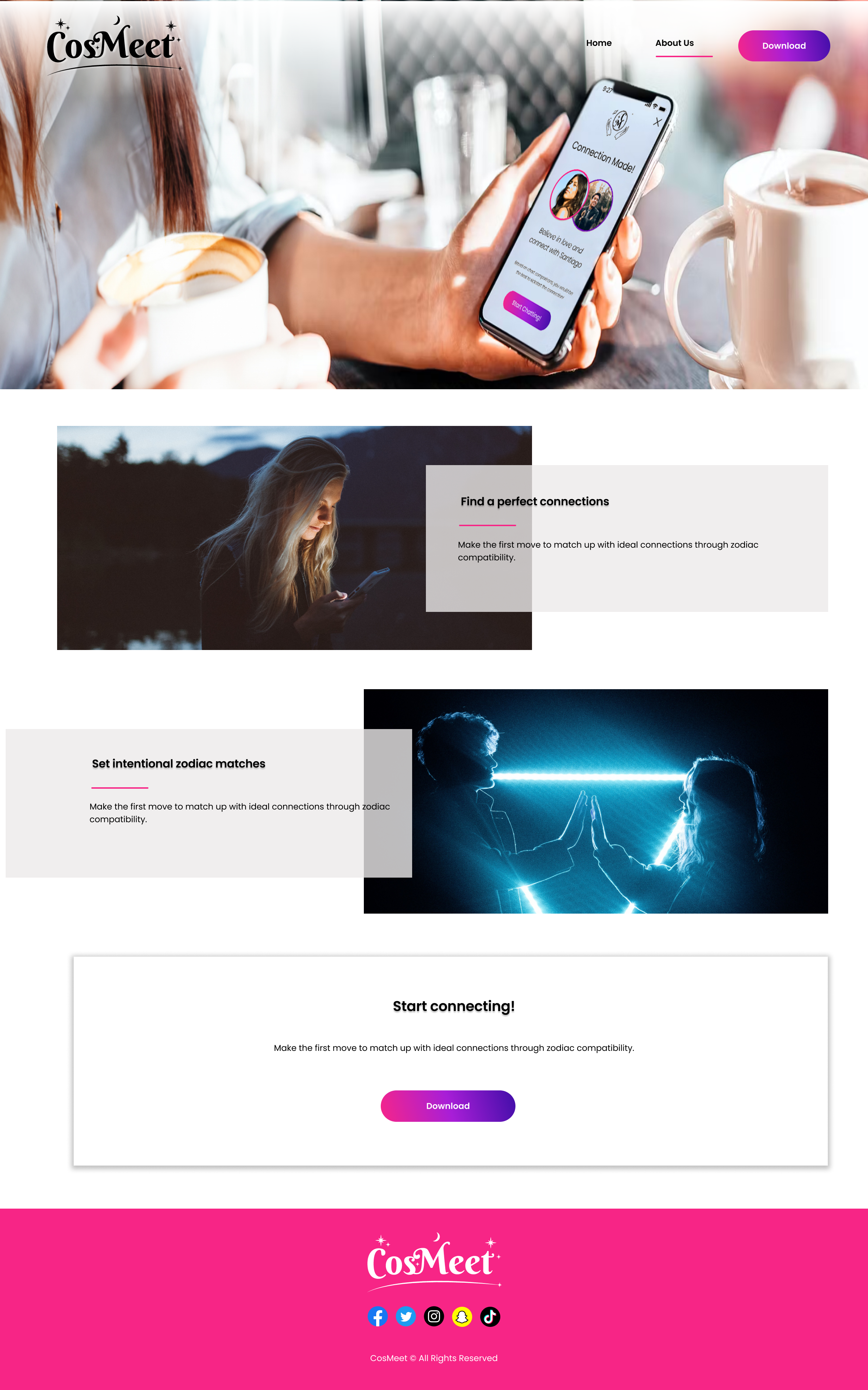
We worked on a user flow to figure out the basic journey our users would take through the app to hit all of the features that we decided on in our ideation phase. We also were making a coded website to act as an advertisement page for our site as well as give more information about the app.
Rather than the whole team make our own versions of the whole user flow, I coordinated each member and myself to develop an equal number of pages. When the pages were completed, we went through each of them, discussing what was strong and needed improvement.
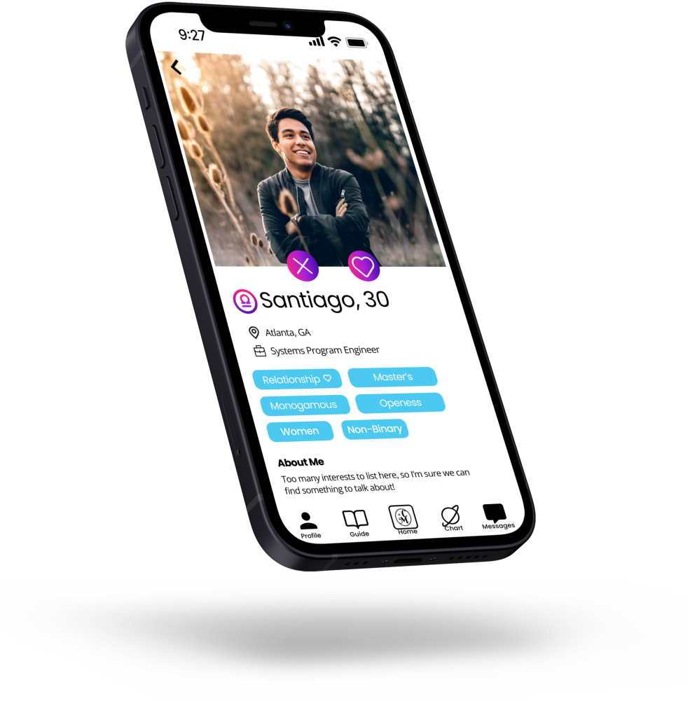
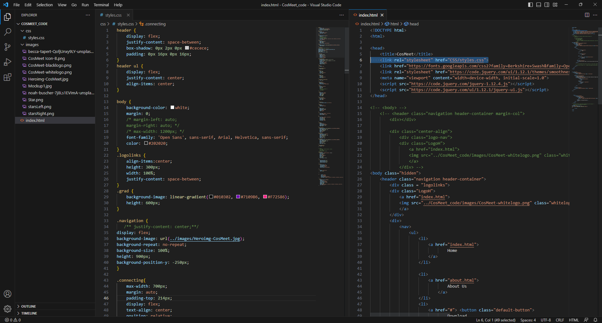
Once we decided on what our desktop page and mobile app layouts would look like, we were able to put together our first prototype. Diana and I also took on the challenge of coding the webpage with HTML, CSS, and JavaScript to replicate our original mockup in Figma. We were ready to start usability testing on our mobile app once we found the low fidelity prototype accomplished the tasks that our users would complete and provide feedback for.
The style guide served as a universal key for us to follow once we completed our usability tests and created a high fidelity mockup of our final prototype. We aimed for a cosmic, space feeling to the user interface while keeping in mind that it should still be inviting to the user. Diana and I created a logo with the intention of keeping the simplistic but memorable iconography of our app.
USABILITY TESTING
We went into our testing with five major tasks for users to accomplish during testing: sign up for the app, select a match, chat with a match, view their zodiac information, and view their compatibility information.
One of the major issues users had been our toolbar. Our icons weren’t clear in what the icon navigated to. They found our onboarding process to not be as clear and informative as they would’ve wished it to be. They also wanted better clarity of explanation with the correlation with zodiacs and their chart with the matches they were gaining. It was then that we had to understand the wider audience we would seek to attract to our product. Only a small percentage of the general population can fully identify the meanings in a birth chart, and even then, we might overload the user with all the information that encompasses a birth chart. We revisited the chart, giving them a basic chart but deciding to add explanations one what elements of the chart pertain to romantic connections.
We corrected these issues and applied the style guide to our final mockup of our app and website.
CONCLUSION
CosMeet has many spaces of growth. Some next steps for this app would be the inclusion of additional website features:
Inclusion of better safety features (user verification, date tracking, alert SOS system
Interactive dating style games to increase users’ comfortability with matches
Premium features: AI curated matches, expert dating coaches’ sessions and tips
We’d also like to do more rounds of user testing as well as A/B testing to ensure we are providing our demographic with as engaging an app as possible. We’d also like to reduce the frequency of ghosting and provide users with an experience that encourages healthy dating and personal relationships.
